
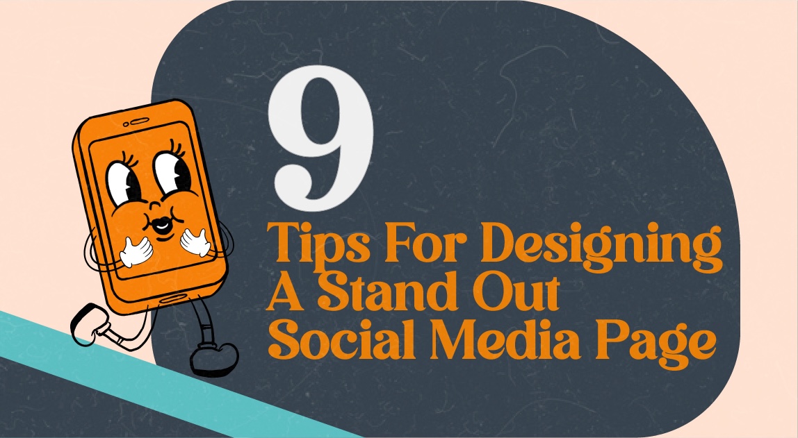
For Beginners: 9 Tips for Designing a Social Media Page That Stands Out
In today’s digital landscape, your social media page is often the first touchpoint between your brand and potential customers. Before they visit your website, book your services, or buy your products, they’re likely to check your Instagram, TikTok, Facebook, or LinkedIn. A poorly designed page may turn people away, while a polished and consistent design […]
Sep 4, 2025
 6 mins read
Matin Wallister
Co-founder & CEO of Plexxie.


In today’s digital landscape, your social media page is often the first touchpoint between your brand and potential customers. Before they visit your website, book your services, or buy your products, they’re likely to check your Instagram, TikTok, Facebook, or LinkedIn. A poorly designed page may turn people away, while a polished and consistent design can inspire trust, spark curiosity, and make your brand memorable.
Think of social media as the modern shopfront: your design is the “window display” that either draws people in or makes them scroll past.
In this guide, we’ll cover nine beginner-friendly tips to help you create a social media page that looks professional, resonates with your audience, and stands out in the crowded online space.
1. Define Your Brand Identity
Brand identity is the personality of your business. It shapes how people perceive you and sets the tone for your design.
How to build it:
- Core questions to ask yourself:
- What values does my brand stand for?
- If my brand were a person, how would I describe them (fun, serious, elegant, bold)?
- What emotions should people feel when they see my content?
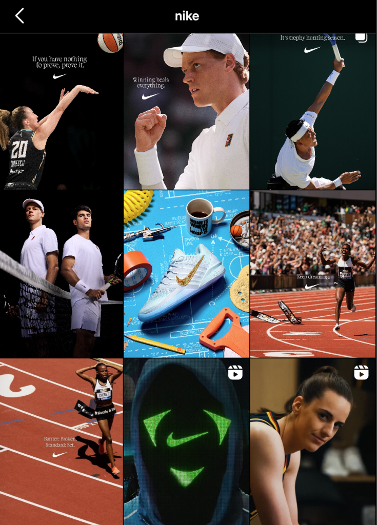
Example: Nike projects energy, motivation, and boldness. Their social media reflects this with high-contrast colors, sharp photography, and empowering copy. A wellness brand might lean into softer colors, minimal layouts, and calming visuals to reinforce a sense of peace and trust.
Tip: Write down three adjectives to describe your brand. Use these as your “north star” when making design decisions.
2. Stay Consistent
Consistency builds recognition. When your audience sees familiar colors, fonts, and layouts, they quickly connect it to your brand without needing to see your logo.
How to stay consistent:
- Create a brand guideline document that lists:
- Logo usage (with variations for light and dark backgrounds).
- Primary and secondary brand colors.
- Approved fonts for headings and body text.
- Examples of acceptable photo styles (e.g., candid, studio, stock).
- Use scheduling and design tools (e.g., Canva or Adobe Express) to create reusable templates for posts and stories.
Case Study: Coca-Cola rarely changes its use of red and white. This simple but consistent visual identity makes their posts instantly recognizable worldwide.
3. Use Brand Colors Strategically
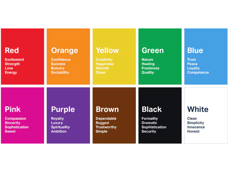
Colors influence emotions and behavior. For example, blue signals trust and professionalism, green suggests health and eco-friendliness, and red conveys passion and urgency.
How to apply it:
- Choose three to five colors (one primary, two secondary, and optional accents).
- Apply them consistently across your profile image, cover photo, highlight covers, and posts.
- Use online tools like Coolors or Adobe Color to generate harmonious palettes.
Example: A vegan café might use earthy greens, beige, and pops of orange to communicate freshness and energy.
4. Design with Visual Appeal in Mind
Good design is not about adding more elements but arranging them so they work together. Rely on the elements of design and seven design principles: balance, alignment, contrast, repetition, hierarchy, proximity, and space.
Practical tips:
- Use contrast to highlight your CTA (e.g., a bright “Shop Now” button on a muted background).
- Apply white space generously—it makes content more digestible.
- Stick to two fonts max (one for headings, one for body text).
Example: Apple’s social media consistently uses clean, minimal visuals with lots of negative space, reflecting their product design philosophy.
5. Adapt to Each Platform’s Format
One-size-fits-all doesn’t work on social media. Different platforms have different design rules, audience expectations, and technical requirements. Use this size guide as a reference!
Sizing guide (as of 2025):
- Instagram feed posts: 1080 × 1350 (portrait)
- Instagram Stories/Reels & TikTok: 1080 × 1920 (full vertical)
- Facebook cover: 820 × 312
- LinkedIn cover: 1128 × 191
- YouTube banner: 2560 × 1440
Platform culture:
- LinkedIn: Infographics and professional visuals perform better than memes.
- TikTok: Quick, visually engaging videos with on-trend design.
- Pinterest: Aesthetic-driven pins with tall aspect ratios.
Pro Tip: Always preview your content on mobile before posting—over 80% of social media browsing happens on phones.
6. Prioritize Images Over Text
Humans process visuals 60,000 times faster than text. Posts with images get significantly higher engagement on platforms like Facebook, Twitter (X), and LinkedIn.
How to do it:
- Use images or videos as the main attention-grabber.
- Limit text overlays to short, punchy phrases.
- Ensure any text is legible on both small and large screens.
Bad Example: An Instagram post filled with paragraphs of text over an image.
Good Example: A clean product photo with a three-word tagline and a small logo in the corner.
7. Keep Promotions Simple and Direct
Less is more. When promoting a sale, event, or campaign, don’t overwhelm your audience with too many messages.
Best practices:
- Highlight one key benefit or offer.
- Use bold visuals that instantly signal the promotion (e.g., bright discount tags, product shots).
- Place your CTA front and center (“Shop Now,” “Sign Up,” “Limited Time Only”).
Case Study: Sephora’s promotional posts often feature one hero product, clean photography, and a simple message (“20% Off Sitewide”). This clarity drives more clicks than cluttered graphics.
8. Optimize Your Profile Design
Your social media profile is the digital handshake of your brand.
Checklist:
- Profile picture: Use your logo or a simplified icon version of it.
- Cover photo (if applicable): Update seasonally or for key campaigns.
- Bio: Short, clear, and aligned with your brand tone.
- Highlight covers (Instagram): Use branded icons with consistent colors.
Example: Spotify uses its logo consistently across platforms and updates its banners with new artist campaigns, showing both brand consistency and adaptability.
9. Use Accessible Design Tools
Not everyone has access to Adobe Creative Suite—and that’s okay. Beginner-friendly tools can help you design like a pro:
- Canva: Easy templates, drag-and-drop, free and paid plans.
- Adobe Express: Great for branded templates.
- Pixlr: Free photo editor alternative to Photoshop.
- Marq (formerly Lucidpress): Best for collaborative brand asset management.
These tools also provide ready-made templates tailored for each platform, saving you time while maintaining professional quality.
Bonus: Respect Platform Rules
Nothing ruins your momentum like getting penalized—or worse, suspended—for breaking content rules.
Things to watch out for:
- Copyright: Always use royalty-free or properly licensed images, videos, and music.
- Community guidelines: Avoid sensitive or inappropriate imagery.
- Transparency: Label sponsored content correctly to comply with ad policies.
Tip: Bookmark each platform’s terms of service and advertising guidelines so your team can reference them quickly.
Conclusion
Designing a standout social media page isn’t about being the most artistic—it’s about being clear, consistent, and intentional. Start with your brand identity, create a cohesive design system, and adapt your content for each platform.
By following these nine tips, you’ll not only capture attention but also build credibility and loyalty with your audience. Remember:
- Your visuals tell a story before your captions do.
- Consistency builds recognition.
- Simplicity and clarity drive engagement.
Stay authentic, monitor feedback, and keep refining your design approach. Social media trends evolve quickly—but with these principles in place, your brand will always stand out.
Related Articles

How To Create A Buyer Persona
June 22, 2023
6 mins read

3 Steps To Manage A Social Media Crisis
Jan 13, 2023
7 mins read
The What, Why and How Of Social Media Analytics
Apr 29, 2023
7 mins read

5 Trends that will Dominate Influencer Marketing in 2023
Oct 14, 2022
6 mins read


