9 Font Hacks for Instagram Stories You Should Know
Instagram has been the dominant platform when it comes to social media in this generation, hosting over a billion users monthly worldwide in 2022. However, we all know how “limited” their Story function may seem like. In fact, there is so much more within the platform that the everyday Joe may not know about and […]
May 10, 2023
 7 mins read
Instagram has been the dominant platform when it comes to social media in this generation, hosting over a billion users monthly worldwide in 2022. However, we all know how “limited” their Story function may seem like. In fact, there is so much more within the platform that the everyday Joe may not know about and as a creative, I’m here to show you how to unlock that potential.
With every possible social media marketing agency and their clients touching base on the platform, it is time for you to unlock the door to a new way of utilizing stories and here is how you can maximise the potential of the platform.
9 Font Hacks For Instagram Stories
- Utilise your creativity to its finest.
- Select the colours from your image.
- Select secret colours from the colour palette.
- Using gradients for texts.
- Using hidden fonts.
- Using GoDaddy Studio for more fonts.
- Create dynamic Instagram stories.
- Create depth to your Instagram story designs.
- Keep your design clean.
1. Utilise your creativity to its finest.
The first key to unlocking a new realm of creativity within Instagram stories is to first unlock your own creativity with the features already available. This was a hack I picked up in the days where I started my creative journey, with a lack of resources in phone applications as compared to now and no access to Adobe.

Here is how to utilize this first hack:
- First, look at the fonts available, look for a nice Sans Serif font like the Proxima Nova (Second option)
- Second, see what letters can be used to form solid shapes. In this case I tend to use capital letters like “I” and “O”.
- Next, it’s all about the details. Arrange your new shapes as you like and touch up with the brush tool or duplicate it! The result of this should look something like the image below!
- Lastly, design it according to your desire! A final product could look something like this!
2. Select the colours from your image.
We all know how limited colours are to Instagram Stories palettes, with a few distinct colours and different hues of it available to us. Colours as creatives should know, play an important part in a design.

To maximise the colours given to us, here’s tip #2 on how you can elevate your design through images:
- Select the eyedropper tool over at the left side of the colours.
- From images used in your design, use the eyedropper to select colours that match your design inspiration.
- This can also be used on colour palettes within your client’s brand guidelines, keeping the brand account cohesive in its posting designs.
3. Select secret colours from the colour palette.
I’ve gone through how you can enhance your colour choice through images of the brand using the eyedropper tool, but what if you lack imagery? Then here is the second part to expanding your colour palette without imagery. It’s so simple yet easy so be prepared to be shocked!

- As usual, open up the colour palette feature.
- Instead of accessing the eyedropper tool, this time press and hold onto any colour and swipe up! This is how it would look like.
- Now you have access to a wide variety of colours just like you would in design applications! All you need to do is gauge by eye the hue of the brand colours, keeping the aesthetic of the brand’s accounts consistent too!
4. Using gradients for texts.
A gradient always elevates a design by using a spectrum of colours to create vibrancy and contrast in a design. Many modern designs utilise gradients in ther design, becoming a common style that client’s and brands may want to catch up with.
To become a master at the art of finger gymnastics and mastering gradient texts in Stories, check out how to do so in this guide that explains better!
5. Using hidden fonts.
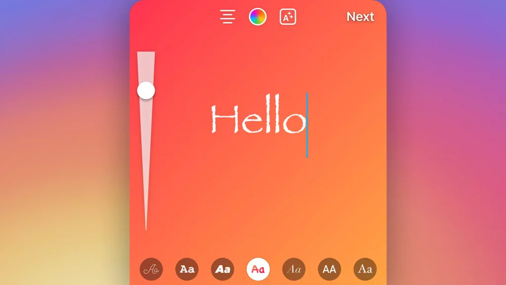
You may know of Instagram Stories nine available font families, ranging from Serifs to Sans Serifs and even Typewriters. However, did you know that there is a hidden typeface among the nine? Papyrus is a unique font made available as a secret function on Instagram Stories.
On how to access it, feel free to find out more from this guide where I originally found this hack too!

With 10 available typefaces of different styles. It’s easy to pick out one that matches your client’s brand image, even though most of the typefaces aren’t of the brand’s guidelines. It still can help to create brand consistency by having similar aesthetics to the brand guidelines.
6. Using GoDaddy Studio for more fonts.
If the 10 available font families aren’t aligned to the brand image of your client, feel free to explore GoDaddy Studio, an application which can be used to add downloaded fonts from online, also providing direct posting to Instagram Stories, which can also be used to elevate the design if let’s say designing on Stories is a hassle or if you may need it urgently.
For an in-depth guide on how to access this larger pool of typefaces for brand consistency, find out more here!

7. Create dynamic Instagram stories.
A feature added in the recent years to Instagram stories would be the animated text feature. As the headline goes, constant, moving dynamic elements have always been key in attracting attention of audiences as seen from the likes of short-form content like TikToks and GIF.
With this animated text feature, there’s more to play around with a design, adding that dynamism rather than a static, stale post. To find out more about the latest features just like this, feel free to check out our blog on the latest Instagram features!

8. Create depth to your Instagram story designs.
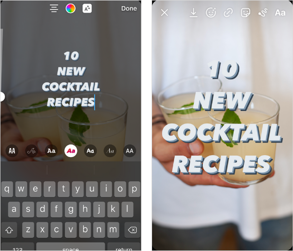
There are many ways to create depth in a design for Instagram stories. One way is to utilise elements and text in repetition, may it be subtle or in multiples.
Another way is to create 3D effects or drop shadows that can emphasizing more on the focal points, may it be headers or elements. This is so simple and easy to do!

I’ll show you in three steps on how to achieve it!
- Prepare the element or text for the effect.
- Copy the exact element or text and duplicate it.
- Then utilise the colour palette tool in Hack #4 to find a shade that’s darker than the original colour to create that drop shadow effect
9. Keep your design clean.
Tags like account tags or hashtags are sometimes used to create engagement and awareness on Instagram. However, sometimes you’d might want to keep a Story design clean, or if the client prefers a minimal design, that’s where this feature that has become a trend recently comes into play!
Hide your tags now by just shifting it out of the post, removing it as a possible eyesore to the design, it’s really that simple! Nothing more!

Such a simple hack, but so essential when it comes to keeping a design clean on Stories whilst maintaining the awareness, but it might possibly lose the engagement on the tags.
In Conclusion
I hope that these 9 font hacks in Instagram Story will help to up your creative game and produce better engaging content for your clients. But most importantly, do remember that out of all these hacks, there are many more yet to be explored.
And it’s all up to your creativity to implement these features into new hacks that can unlock the creative potential and freedom of Instagram Stories that many tend to underestimate! Remember, anything can always be unlocked if you are creative enough to explore and implement.


